ICAEW chart of the week: One Big Beautiful Bill Act 2025

My chart for ICAEW this week looks at the impact on the US federal government deficit of the major tax and spending changes passed by Congress and signed into law by President Trump on 4 July 2025.

ICAEW chart of the week: A step chart showing the projected effect of the One Big Beautiful Bill Act 2025 on the average annual US federal government deficit between FY2025 and FY2034. 

Left hand column: Baseline projection $2,109bn. 

Steps 1 to 3 (shaded): Spending cuts -$110bn plus Tax cuts +$449bn plus Extra interest +$68bn. 

Step 4: Net change +$407bn (total of steps 1 to 3). 

Right hand column: Revised projection $2,516bn. 

25 Jul 2025. Chart by Martin Wheatcroft FCA. Design by Sunday. 
Sources: Congressional Budget Office; ICAEW calculations.

My chart this week looks at the impact on the US federal government deficit of the major tax and spending changes passed by Congress and signed into law by President Trump on 4 July 2025. 

The Congressional Budget Office (CBO) published on 21 July 2025 its assessment of Public Law 119-21 (the 21st law passed by Congress in its 119th session), also known as the One Big Beautiful Bill Act 2025 (OBBBA).

OBBBA was passed by Congress and signed into law by President Trump on 4 July 2025 and contains sweeping changes to the US federal tax system as well as a significant shift in spending priorities.

The chart this week attempts to illustrate the impact of OBBBA on the federal deficit by looking at how it changes the average annual projected deficit over the next 10 years from FY2025 (the current fiscal year ending on 30 September 2025) to FY2034, compared with the CBO’s baseline projection.

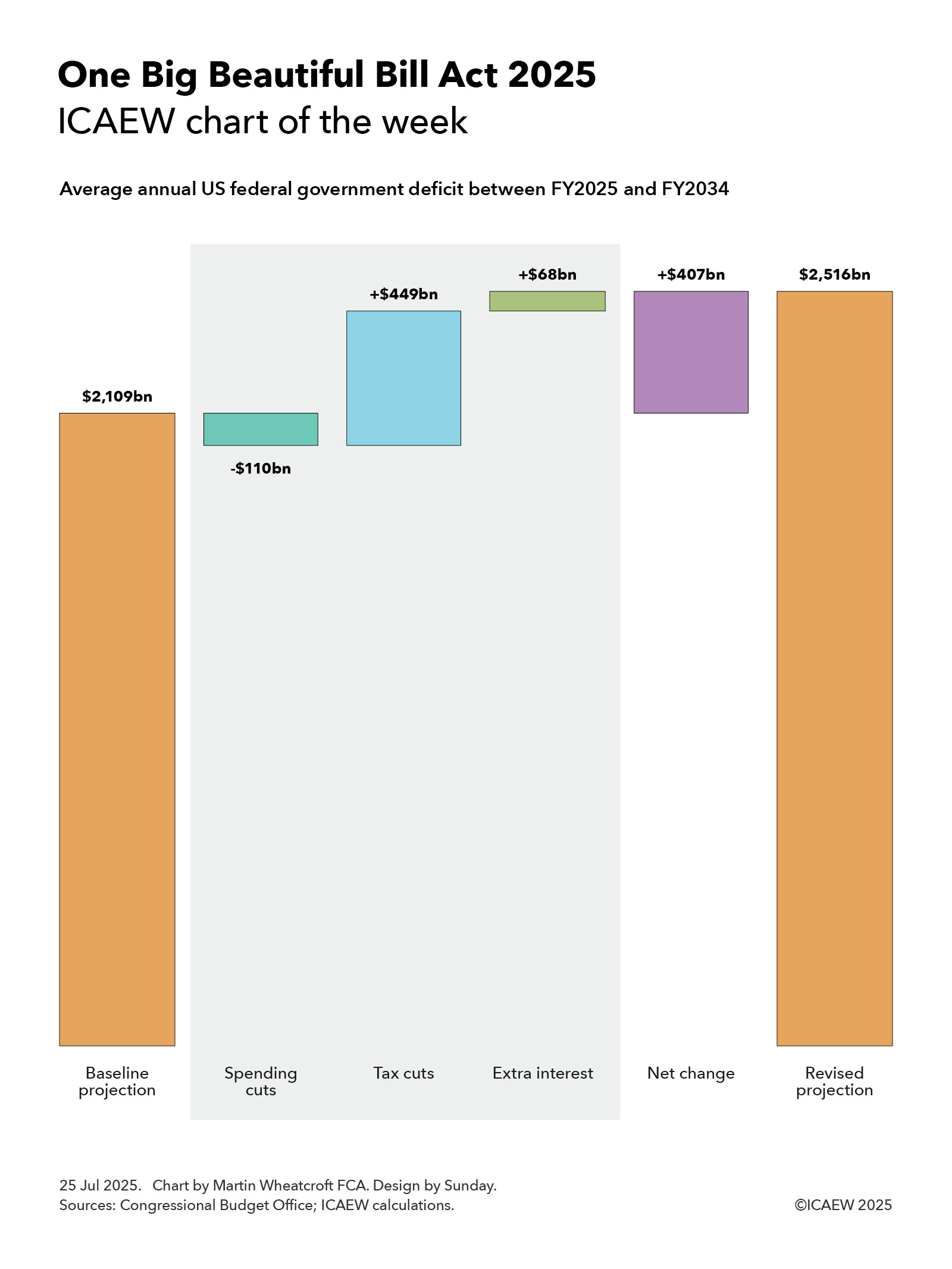
The baseline projection, published by the CBO in January 2025, was for the federal government deficit to increase from $1,865bn in FY2025 to $2,597bn in FY2034, an average deficit over the 10 years of $2,109bn or 5.8% of GDP.

According to the CBO, OBBBA is expected to increase the federal deficit each year by $339bn on average over the period to FY2034, with a net cut in federal spending of $110bn on average offsetting a net cut in revenues of $449bn. The CBO’s assessment does not take account of the additional cost of financing these higher deficits, which ICAEW calculates would add a further $68bn a year on average to the interest bill. 

The consequence is a net increase in the annual federal deficit of $407bn on average over 10 years, taking it to an average of $2,516bn or 7.0% of GDP.

Net spending cuts of $110bn comprise spending increases of $66bn a year on average, net of spending reductions of $164bn a year and incremental ancillary income that is deducted from spending of $12bn. Extra spending includes an extension of child tax benefits ($19bn a year on average) and more money for homeland security and immigration enforcement ($18bn), the military and coastguard ($17bn), farm subsidies ($5bn), air traffic control ($1bn), the mission to Mars ($1bn) and other items ($5bn). 

Spending reductions include cuts in Medicaid and Medicare programmes ($106bn on average each year), education and student loan relief ($30bn), other welfare and health programmes ($19bn), clean energy subsidies ($8bn) and other cuts ($1bn), while ancillary income comprises $9bn on average from spectrum auctions, $2bn from oil and gas leases, and $1bn extra from higher visa fees.

Net tax cuts comprise $511bn a year in tax cuts less $62bn a year in tax increases.

Tax cuts include making previous temporary tax cuts permanent ($379bn), business tax reforms ($97bn), personal tax reforms ($26bn), energy related tax credits ($4bn), Medicaid and Medicare related tax deductions ($3bn), and other ($2bn). Tax increases include the termination of tax reliefs for clean energy ($47bn a year), addressing tax loopholes ($6bn), additional immigration fees included in revenue ($4bn), taxing low-value international shipments ($4bn) and other ($1bn).

The CBO doesn’t directly conclude what this will mean for the US national debt (debt held by the public), which was expected in January’s baseline projection to increase from $28.2tn or 98% of GDP at the start of the current financial year to $49.5tn or 117% of GDP on 30 September 2034. Adding $4.1tn over 10 years to that amount suggests this would increase to $53.6bn or 127% of GDP.

These numbers don’t take account of the anticipated economic boost of lower taxes that should partially offset some of the tax impacts set out in the CBO’s analysis, as well as increasing the denominator in the deficit to GDP ratio. However, they also don’t take account of other factors such as US trade policy – including the additional tax receipts from tariffs and the potential effect that those higher taxes will have on the US economy – or many other policies of the US administration. We will need to wait for the CBO’s next full economic and fiscal projections later in the year to understand more about what that might mean.

Either way, the OBBBA will go down as one of the most consequential legislative acts of the US Congress in recent years.

This chart was originally published by ICAEW.

First quarter fiscal deficit in line as Chancellor ponders tax rises

Despite borrowing to fund the deficit in the first three months of the financial year of £58bn being in line with expectations, it was still the third-highest first quarter result on record.

The monthly public sector finances release for June 2025 published by the Office for National Statistics (ONS) on 22 July reported a provisional deficit of £21bn for the month of June and £58bn for the three months then ended. This is £4bn more and in line with budget respectively, and £7bn and £8bn more in each case than the first fiscal quarter a year ago.

Alison Ring OBE FCA CPFA, ICAEW Director of Public Sector and Taxation, says: “Even if borrowing to fund the deficit in the month of June was only a little higher than expected and was in line with expectations in the first three months of the financial year, the first quarter was still the third highest since monthly records began. This trajectory will not have lightened the Chancellor’s mood as she decides which taxes to put up in the Autumn Budget later this year. 

“The government has two big problems with the public finances: the short-term outlook – which is bad – and their long-term prospects – which are worse. Public spending continues to outpace tax receipts by a significant margin, while the OBR has reiterated its conclusion that the public finances are unsustainable over the next 25 to 50 years if this and future governments continue on the current path. 

“Unfortunately, the major challenges facing the public finances over the next quarter of a century and beyond means that this will not be the last time a chancellor of the exchequer needs to come back asking for more. Now is the time to stop kicking the can down the road and develop a comprehensive long-term fiscal strategy to put the public finances onto a sustainable path.”

Month of June 2025

The fiscal deficit for June 2025 was £21bn, £4bn more than budgeted and £7bn more than a year previously. According to the ONS, this was the second-highest June deficit since monthly records began in 1993, with only June 2020 during the pandemic being higher.

First quarter to June 2025

The deficit for the first three months of the 2025/26 financial year was £58bn, £8bn more than a year previously. Despite being in line with budget, this is the third-highest first quarter deficit since monthly records began (after the first quarter deficits in 2020/21 and 2021/22). 

Table 1 highlights how total receipts and total current spending in the three months to June 2025 of £278bn and £323bn were up 7% and 8% respectively, compared with the same period last year.

Receipts were boosted by the employer national insurance increase from April 2025 onwards in addition to the effect of fiscal drag on income tax caused by the continued freeze in personal tax allowances. Meanwhile, the increase in current spending over the past year was primarily as a consequence of public sector pay rises, higher supplier costs and rises in welfare benefits.

The increase in debt interest of £5bn to £42bn consisted of a £6bn increase in indexation on inflation-linked debt as inflation returned less a £1bn reduction in interest on variable and fixed-interest debt. The latter was primarily the effect of a lower Bank of England base rate offsetting a higher level of debt compared with a year ago.

Net investment of £13bn in the first quarter of 2025/26 was £1bn or 8% higher than the same period last year. Capital expenditure of £22bn was up by £1bn and capital transfers (capital grants, research and development funding, and student loan write-offs) of £9bn were up by £1bn, less depreciation of £18bn up by £1bn.

Table 1: Summary receipts and spending

3 months to June2025/26
£bn
2024/25
£bn
Change
%
Income tax6460+7%
VAT5250+4%
National insurance4841+17%
Corporation tax2624+8%
Other taxes5756+2%
Other receipts3130+3%
Current receipts278261+7%
Public services(178)(165)+8%
Welfare(77)(72)+7%
Subsidies(8)(8)
Debt interest(42)(37)+14%
Depreciation(18)(17)+6%
Current spending(323)(299)+8%
Current deficit(45)(38)+18%
Net investment(13)(12)+8%
Deficit(58)(50)+16%

Borrowing and debt

Table 2 summarises how the government borrowed £64bn in the first quarter to take public sector net debt to £2,874bn on 30 June 2025. The movements comprised £58bn in public sector net borrowing (PSNB) to fund the deficit and £6bn to fund government lending activities and working capital movements.

The table also illustrates how the debt to GDP ratio increased from 95.2% of GDP at the start of the financial year to 96.3% on 30 June 2025, with the incremental borrowing partly offset by the ‘inflating away’ effect of inflation and economic growth adding to GDP, the denominator in the net debt to GDP ratio.

Table 2: Public sector net debt and net debt/GDP

3 months to June2025/26
£bn
2024/25
£bn
PSNB5850
Other borrowing6(3)
Net change6447
Opening net debt2,8102,686
Closing net debt2,8742,733
PSNB/GDP2.0%1.8%
Other/GDP0.2%(0.1%)
Inflating away(1.1%)(1.5%)
Net change1.1%0.2%
Opening net debt/GDP95.2%95.6%
Closing net debt/GDP96.3%95.8%

Public sector net debt on 30 June 2025 of £2,874bn comprised gross debt of £3,286bn less cash and other liquid financial assets of £412bn. 

Public sector net financial liabilities were £2,504bn, comprising net debt of £2,874bn plus other financial liabilities of £706bn less illiquid financial assets of £1,076bn. Public sector negative net worth was £878bn, being net financial liabilities of £2,504bn less non-financial assets of £1,626bn.

Revisions

Caution is needed with respect to the numbers published by the ONS, which are repeatedly revised as estimates are refined and gaps in the underlying data are filled. This includes local government where the numbers are only updated in arrears and are based on budget or high-level estimates in the absence of monthly data collection.

The latest release saw the ONS revise the previously reported deficit for the two months to May 2025 down by £1bn and revise public sector net debt on 31 May 2025 up by £7bn.

For further information, read the public sector finances release for June 2025.

This article was originally published by ICAEW.

ICAEW chart of the week: climate change and the public finances

My chart for ICAEW this week looks at how climate change is now expected to make the OBR’s dire predictions for the public finances even worse.

A line chart on climate change and the public finances, with three curved lines for public sector net as a share of GDP over fifty years. with labels from March 2034 onwards. 

Bottom line: Baseline public sector net debt/GDP. Falls from just under 100% of GDP to 90% of GDP in March 2034 and then rises to 100%, 130%, 188% and 274% of GDP in March 2044, 2054, 2064 and 2074 respectively. 

Middle line: Baseline + climate change (below 3°C scenario). Rises from 94% of GDP in March 2034 (label not shown) to 114%, 157%, 235% and 348% of GDP in March 2044, 2054, 2064 and 2074 respectively. 

Top line: Baseline + climate change + economic shocks. Rises from 104% in March 2034 to 134%, 187%, 275% and then 398% in March 2074. 

18 Jul 2025. Chart by Martin Wheatcroft FCA. Design by Sunday. Sources: OBR, 'Fiscal risks and sustainability', Sep 2024 and Jul 2025 reports.

ICAEW’s chart of the week is on climate change this week, illustrating how it could add a further 74 percentage points to the Office for Budget Responsibility (OBR)’s already disheartening baseline projection for public sector net debt of 274% of GDP to reach 348% of GDP, or potentially 398% if economic shocks are included.

The baseline projection, published by the OBR in September 2024, showed public sector net debt as a proportion of the size of the economy falling from just under 100% of GDP to 90% of GDP in March 2034 and then rising to 100%, 130%, 188% and 274% of GDP in March 2044, 2054, 2064 and 2074 respectively. 

One of the main drivers of the baseline projection is the expected rise in spending on pensions, health and social care as more people live longer, sometimes less healthy lives, combined with a falling fertility rate that means there will be proportionately fewer working age adults to pay the taxes needed to fund that rise.

Incorporating the OBR’s new central projection for climate change, public sector net debt would be 94% of GDP in March 2034 (not shown in the chart because of a lack of space between lines) and then 114%, 157%, 235% and 348% of GDP in March 2044, 2054, 2064 and 2074 respectively. Adding potential economic shocks on top would increase the projection for public sector net debt/GDP to 104% in March 2034 rising to 134%, 187%, 275% and then 398% in March 2074.

The September 2024 baseline projection included the loss of fuel duty receipts from the phasing out of petrol and diesel vehicles between now and 2050, but the OBR in its recent July 2025 fiscal and sustainability report has looked in more detail at both the incremental costs of transitioning to net zero and the damage that is likely to result from a much warmer and wetter climate in several different scenarios.

OBR’s central ‘below 3°C’ scenario is based on global average temperatures rising by 2.9°C above pre-industrial levels by 2100, of which weather and other damage associated with a much warmer and wetter climate is projected to add 17 percentage points to accumulated debt over the next half century from direct and indirect costs and revenue losses. Climate damage is also expected to result in slower economic growth that would add 27 percentage points over 50 years by reducing the denominator in the debt to GDP ratio. The government’s share of transition costs (including lower tax receipts from higher private sector spending) is projected to add 7 percentage points, while there is a 22 percentage point impact from the incremental debt interest that would be incurred on a higher level of debt.

This is before taking account of recessions and other potential economic shocks, which based on historical patterns are expected to add 10% of GDP to public sector net debt every decade or so.

The chart does not reflect other risks identified by the OBR in its latest report, where it reports that the exposures to the public finances have increased since its assessment last year. One risk they did look at in some detail is the prospect of higher interest rates on government borrowing on the basis that demand for gilts reduces as the Bank of England winds down its holdings of gilts (quantitative tightening) and defined benefit pension schemes gradually sell their holdings of gilts to fund pension payments. This risk might be mitigated by selling shorter-dated gilts, although shorter maturities would make the public finances less resilient by increasing the amount of debt needing to be refinanced each year.

The OBR’s dismal assessment of the prospects for the public finances highlights just how difficult a financial position the UK finds itself in, with a lot to do (and some luck needed) if it is to be restored to a sustainable path. At the same time, the costs of climate change are now becoming that much more apparent as extreme weather events and other climate-related costs start to show up in public finance and insurance data.

For more information about the role of the accountancy profession in climate change, visit ICAEW’s climate hub.

This chart was originally published by ICAEW.

ICAEW chart of the week: Balance of payments

Our chart this week takes a look at the UK’s balance of payments in the year to 31 March 2025 and wonders what the future has in store.

A step chart on the balance of payments in 2024/25 showing payments and receipts on either side, with three shaded sub-steps in-between adding up to the current account deficit, being the difference between total payments and receipts. 

Payments £1,401bn = £924bn for imports + £430bn earnings + £47bn transfers.  

Receipts £1,318bn = £880bn from exports + £407bn earnings + £31bn transfers.  

Step 1: Trade deficit (imports and exports) -£44bn. 
Step 2: Primary income deficit (earnings) -£23bn. 
Step 3: Secondary income deficit (transfers) -£16bn. 

Step 4: Current account deficit (sum of steps 1 to 3) -£83bn.   

11 Jul 2025. Chart by Martin Wheatcroft FCA. Design by Sunday. Source: ONS, 'Balance of payments, UK: Jan-Mar 2025', seasonally adjusted, four quarters to Mar 2025.

The UK is a trading nation as demonstrated by its balance of payments, the topic of our chart this week.

According to the Office for National Statistics (ONS), the UK made external payments of £1,401bn in 2024/25, comprising £924bn in exchange for imported goods and services, £430bn in investment and other earnings paid to foreign investors and workers, and £47bn in remittances, international development aid and other transfers.

On the other side of the ledger, the UK received £1,318bn from external sources in 2024/25 comprising £880bn in exchange for exported goods and services, £407bn from foreign investment and other earnings, and £31bn in remittances and other transfers.

As our chart illustrates, this resulted in a current account deficit of £83bn in 2024/25, comprising a trade deficit of £44bn, a primary income deficit on earnings of £23bn, and a secondary income deficit on transfers of £16bn.

The trade deficit of £44bn can be analysed between a deficit on goods of £239bn (being payments for goods imports of £602bn net of receipts from goods exports of £363bn) and a surplus on services of £195bn (with payments for services imports of £322bn being exceeded by receipts from services exports of £517bn).

The primary income deficit of £23bn principally relates to the £22bn difference between £427bn in investment income and profits generated in the UK paid to foreign owners in 2024/25 and the £407bn received by UK investors from their investments overseas, plus £1bn from the net of £3bn paid in compensation to foreign workers less £2bn earnt by UK workers from foreign sources.

The secondary income deficit of £16bn comprises a net £10bn in government-related transfers, being £11bn in payments made by the UK government (primarily for international development and humanitarian aid) less £1bn received from the EU and others, and a net £6bn from the differences between remittances and other transfers sent abroad of £36bn less remittances and other transfers received into the UK of £30bn.

The chart does not show the other side of the balance of payments, which is a £77bn non-seasonally adjusted surplus on the investment account less a £4bn deficit on the seasonally adjusted capital account, a net cash inflow of approximately £73bn. 

The £77bn surplus on the investment account reflected net investment into the UK of £370bn over the course of the four quarters to March 2025, less £293bn net investment abroad. The £4bn deficit on the capital account primarily relates to international development capital grants, with £1bn from the disposal of non-financial assets to foreign owners offset by £1bn in UK purchases of foreign non-financial assets.

While some of the difference of £10bn between the current account deficit of £83bn and the net surplus on the investment and capital accounts of £73bn is because of timing differences from seasonal adjustments, most of it arises because the ONS is not able to gather data on all international payments and receipts. In theory the balance of payments should balance exactly.

The current account deficit of £83bn in 2024/25 was equivalent to 2.9% of the UK’s GDP of £2,891bn for the same period, being the net of total payments and total receipts of 48.5% and 46.6% of GDP respectively.

Being the difference between two very big numbers, the current account deficit is the net effect of billions of transactions every year as goods and services are bought and sold internationally, earnings are paid and received, and money is transferred at exchange rates that change on a minute-by-minute basis. Despite this the current account deficit in 2024/25 was only 0.1 percentage points higher than the average 2.8% of GDP since 1997, even if it has gone as high as 6.9% in an individual quarter.

While the global trade war was initiated by the US is likely to have a major impact on how money flows around the world, it is much harder to guess how significant that effect will be, either on the overall global economy or on any individual country, in particular the UK. 

Either way, the balance of payments is likely to become a more prominent statistic in the coming months and years. 

This chart was originally published by ICAEW.

ICAEW chart of the week: Energy price cap

My chart for ICAEW this week looks at the domestic energy price cap since its peak in the first quarter of 2023.

Column chart on the energy price cap by quarter since 2023. There is a vertical line between 2023 Q4 and 2024 Q1 to show the point when typical energy usage changed. 

Price cap 2023 Q1 £4,279, Q2 £3,280, Q3 £2,074 and Q4 £1,923; 2024 Q1 £1,928, Q2 £1,690, Q3 £1,568 and Q4 £1,179; 2025 Q1 £1,738, Q2 £1,849, Q3 £1,720 and Q4 £1,698 (pale colours as a forecast). 

Bars show annual standing charges and per kWh electricity and gas prices for each quarter as set out in the accompanying article. 

4 Jul 2025. Chart by Martin Wheatcroft FCA. Design by Sunday. Sources: Ofgem, Cornwall Insight. Typical electricity and gas usage 2,900kWh and 12,000KWh to 2023 Q4 and 2,700kWh and 11,500kWh from 2024 Q1.

According to Ofgem, the domestic energy price cap in Great Britain for the third quarter of 2025 commencing on 1 July is £1,720 per year. This is a 7% reduction from the £1,849 per year price cap in the previous quarter, based on typical energy usage of 2,700kWh of electricity per year and 11,500kWh of gas per year.

The above statement may be confusing because the amounts quoted are not what is capped and the price cap only lasts for a quarter rather than a year. 

There is, however, a method to Ofgem’s madness. There are actually 252 price caps set by Ofgem each quarter that it distils into one headline number, being the average of fourteen regional prices for a dual-fuel standard credit user multiplied by typical annual usage plus the 5% VAT that is payable on domestic energy supplies. 

This single annualised number makes it much easier to communicate what is happening to energy prices and also avoids getting into the complications of seasonal variations in energy usage during the course of each year.

The 252 price caps comprise two caps – a maximum per kWh price and a maximum daily standard charge – for each of three different types of users (single-rate users of electricity, multi-rate ‘Economy 7’ users of electricity and users of gas), multiplied by three different categories of customers (standard credit, direct debit and prepayment meters), and then multiplied by 14 regional variations

The headline price cap is not the maximum that households will pay in a year, nor should you divide by four to guess at the amount payable for that individual quarter. Those paying by direct debit or using prepayment meters (since July 2023, previously prepayment customers paid more) are capped at 7% and 10% on average less than standard credit users based on typical usage, while maximum prices and standing charges also vary by region. Larger homes are likely to use much more energy and so pay a lot more, while smaller homes are likely to pay less. 

Meanwhile, energy suppliers have started to offer annual or longer fixed-rate deals again, typically at a discount to the current maximum prices but with the price protection that such deals offer offset by the risk that the fixed-rate in the deal could exceed the price cap in subsequent quarters if prices go down.

As my chart this week illustrates, the annual price cap peaked at £4,279 in the first quarter of 2023, based on average maximum standing charges of £272 per year for both electricity and gas meters, plus 2,900kWh of electricity at 67.47p and 12,000kWh of gas at 17.08p. The price cap fell to £3,280 in the second quarter (£300 standing charges, 50.60p/kWh for electricity and 12.61p/kWh for gas), £2,074 in the third quarter (£300, 30.11p/kWh and 7.51p/kWh) and £1,923 in the fourth quarter of 2023 (£303, 27.35p/kWh and 6.89p/kWh).

Ofgem changed its estimate of typical annual usage to 2,700kWh in electricity and 11,500kWh in gas from the first quarter of 2024, so the £1,928 headline price cap was actually a 3% increase compared with the previous quarter once the change is adjusted for. The price cap fell to £1,690 in the second quarter (£333 standing charges, 24.50p/kWh for electricity and 6.04p/kWh for gas) and £1,568 in the third quarter (£334, 22.36p/kWh and 5.48p/kWh) before rising to £1,179 in the fourth quarter of 2024 (£339, 24.50p/kWh and 6.24p/kWh).

Prices rose in the first quarter of 2025 to £1,738 (£338 standing charges, 24.86p/kWh for electricity and 6.34p/kWh for gas) and £1,849 in the second quarter (£315, 27.03p and 6.99p) before falling to £1,720 in the current quarter that commenced on 1 July and ends on 30 September 2025 (£297, 25.73p/kWh and 6.33p/kWh).

Cornwall Insight projects that the price cap could fall slightly to £1,698 in the fourth quarter (£299 standing charges, 26.17p/kWh and 6.02p/kWh) based on data up to 29 June 2025. However, this could easily change depending on what happens to wholesale prices over the next month and a half before Ofgem sets the next quarterly price cap on 27 August 2025.

Despite the significant fall in energy prices from their peak in the first quarter of 2023, the cap continues to be much higher than it was before the pandemic and the cost-of living crisis. After adjusting for consumer price inflation and changes in estimated typical usage, the £1,720 per year price cap in the current quarter is approximately 26% higher than the original price cap of £1,137 in the first quarter of 2019 (not shown in the chart, based on £177 a year in standing charges, 16.52p/kWh x 3,100kWh typical annual usage of electricity and 3.73p/kWh x 12,000kWh of gas).

While it is positive that energy prices appear to have stabilised at around the current level over the past couple of years, there continue to be significant geopolitical risks that mean that prices could rise significantly in some specific scenarios.

Time to keep our fingers crossed and hope those risks don’t materialise

This chart was originally published by ICAEW.

ICAEW chart of the week: Global GDP

My chart for ICAEW this week looks at the relationship between population and GDP around the world.

A three column chart each adding up to 100% with the central bar showing percentages of the global population, the left-hand bar showing percentages of market GDP. and the right-hand bar showing percentage of power-purchasing-parity (PPP) GDP. The bars are linked with lines to emphasise the relative proportions. 

US & Canada: Market GDP 29% - Population 5% - PPP GDP 16%. 
Europe: Market GDP 23% - Population 7% - PPP GDP 18%. 
China: Market GDP 17% - Population 17% - PPP GDP 20%.  
Rest of the world: Market GDP 24% - Population 28% - PPP GDP 30%. 
South Asia & China: Market GDP 7% - Population 43% - PPP GDP 16%. 

27 Jun 2025. Chart by Martin Wheatcroft. Design by Sunday. Source: IMF, 'World Economic Outlook Database, Apr 2025'.

According to the latest World Economic Outlook Database published by the International Monetary Fund in April 2025, the 387m people that live in the US and Canada, some 5% of the global population of 8.1bn, are together expected to generate about 29% of global economic activity as measured by GDP converted at market exchange rates in 2025. 

The US – the largest economy in the world – is expected to generate 27% with 4.3% of the global population, while Canada with 0.5% of the world’s people represents 2% of the global economy.

My chart this week also shows how the US and Canada together constitute 16% of the global economy using GDP converted on a Purchasing-Power-Parity (PPP) basis that adjusts for the relative cost of living between countries. The US is the world’s second largest economy on this basis with 15% of total economic output, while Canada represents 1.3% of the total.

Europe’s 602m people are 7% of the global population (excluding Russia, but including Georgia) and are expected to generate around 23% of global economic output at market exchange rates in 2025 or around 18% on a PPP basis. 

This includes the 452m people or 5.6% of the total living in the EU that generate 18% of global output or 14% on a PPP basis, the second largest economy on a market exchange rate basis and the third largest after adjusting for purchasing power. Germany with 1% population generates 4.3% and 3% of market GDP and PPP GDP respectively, followed by France (0.8% generating 2.9% and 2.2%), Italy (0.7% generating 2.2% and 1.8%), Spain (0.6% generating 1.6% and 1.4%), the Netherlands (0.2% generating 1.2% and 0.7%) and Poland (0.5% generating 0.9% and 1%). 

Outside the EU, the 70m people in the UK, 0.9% of the world’s total, generate 3.4% of global economic activity on a market exchange rate basis and 2.2% on a purchasing power basis.

China’s 1.4bn people constitute 17% of the world’s population and generate 17% of market GDP, in effect the average level of global economic activity on a per capita basis at current exchange rates. However, on a cost-of-living adjusted basis, they are the world’s biggest economy at 20% of PPP GDP and above average on a per capita basis.

The chart groups the rest of East Asia, South East Asia, Oceania, the Middle East, Russia, Central Asia, Latin America and the Caribbean into a ‘rest of the world’ category with 2.3bn people or 28% of the world’s population. They generate 24% of the global economy on a market exchange rate basis and 30% on a purchasing power basis.

This category includes the 10 ASEAN countries in South East Asia that together make up 8.5% of the world’s population, 3.6% of market GDP and 6.4% of PPP GDP led by Indonesia (3.5%, 1.2% and 1.4%). Others include Japan (1.5% population, 3.6% market GDP and 3.3% PPP GDP), Russia (1.5%, 2.3% and 3.5%), Türkiye (1.3%, 1.1% and 1.8%), Mexico (1.6%, 1.6% and 1.6%), South Korea (0.6%, 1.6% and 1.6%), Australia (0.3%, 1.5% and 1%), Brazil (2.6%, 1.0% and 2.4%), Taiwan POC (0.3%, 1% and 0.8%) and Saudi Arabia (0.4%, 0.8% and 1%).

The final category is South Asia and Africa, which together include many of the poorest countries on Earth, with 43% of the global population but just 7% of the global economy based on market exchange rates and 16% on a cost-of-living adjusted basis.

South Asia’s 2bn people are 24.3% of the world’s population, generating 4.4% of market GDP and 10.3% of PPP GDP. This includes India’s 1.5bn people (17.9% of the global population generating 3.6% and 8.5% respectively), the world’s fifth largest national economy at market exchange rates behind the US, China, Germany and Japan, and the third largest on a PPP basis behind China and the US. It also includes Pakistan (3% of the world’s people generating 0.3% and 0.8% of economic activity) and Bangladesh (2.1% generating 0.4% and 0.9%).

Africa’s 1.5bn people constitute 18.3% of the world’s total, generating just 2.7% of market GDP and only 5.3% of PPP GDP. This includes South Africa (0.8%, 0.4% and 0.5%), Egypt (1.3%, 0.3% and 1.1%), Nigeria (2.9%, 0.2% and 0.8%), Ethiopia (1.4%, 0.1% and 0.2%) and the Democratic Republic of the Congo (1.3%, 0.1% and 0.1%).

The chart illustrates how economic activity, both before and after adjusting for purchasing power, is weighted towards the US and Europe, while South Asia and Africa have a long way to go to become as prosperous.

While this may seem a stiff mountain to climb economically, China’s transformation over the last 30 years provides an example of what is possible, especially as ageing populations in many developed countries reduce their ability to grow as quickly as those countries with much younger demographics such as in South Asia and Africa.

As they say, watch this space.

This chart was originally published by ICAEW.

ICAEW chart of the week: Spending up

My chart for ICAEW this week looks at what the Spending Review 2025 does to total day-to-day spending and capital budgets over the next three years.

A step chart showing the Spending Review 2025 change in total departmental budgets over three years. 

2025/26: Day-to-day spending £517bn + Capital investment £131bn = total £648bn. 

Inflation: +£38bn (+1.9% a year). 

Day-to-day spending: +£21bn (+1.3% a year). 

Capital investment: +£10bn (+2.4% a year). 

2028/29: Day-to-day spending £568bn + Capital investment £149bn = total £717bn. 

20 Jun 2025. Chart by Martin Wheatcroft. Design by Sunday. 
Source: HM Treasury. 'Spending Review 2025'.

Last week’s chart of the week looked at the winners and losers between departments in the Spending Review 2025. This week’s chart looks at the overall picture and the government’s different approaches between operating and capital expenditure.

As my chart this week illustrates, total departmental budgets for the current financial year ending on 31 March 2026 (2025/26) of £648bn are expected to rise to £717bn by 2028/29. This comprises departmental ‘day-to-day’ operating budgets of £517bn in 2025/26 that rise to £568bn in 2028/29 and departmental capital budgets going from £131bn to £149bn over the same period.

Inflation of 1.9% a year on average is expected to add £38bn a year to total departmental spending by the end of the three-year period, with a real-term increase in operating budgets of £21bn by 2028/29 or 1.3% a year on average, and a real-term increase in capital budgets of £10bn or 2.4% a year on average. 

In practice, the increase in day-to-day spending is not much of an increase at all given that ‘government inflation’ is often higher than the GDP inflator all-economy measure of inflation used in HM Treasury’s calculations. Pay awards and supplier price rises are likely to absorb a significant proportion of this additional money, with departments needing to find significant efficiency savings and productivity improvements if they are to avoid cuts to public services, let alone improve them. And, as our chart last week highlighted, several departments are in effect having their operating budgets cut over the spending review period. 

Unlike operating budgets, where total planned departmental spending increases each year broadly in line with inflation and the 1.3% average real-term increase, the average annual real-term increase of 2.4% a year in capital budgets over three years comprises a 6.9% real-term increase in 2026/27, a real-term cut of 0.2% in 2027/28, and a real-term increase of 0.7% in 2028/29. (There is also no increase after inflation in the fourth year to 2029/30, which would reduce the average annual increase over four years to 1.8%.)

This follows an 11.6% real-term increase in capital budgets in 2025/26 that was enabled by the Chancellor’s change to the fiscal rules in the Autumn Budget 2024. This gave the government more flexibility to borrow for capital investment, and the Chancellor chose to front load that investment, no doubt in the hope of accelerating the economic benefits of that investment and of improving public services more quickly than might be possible if spreading the increase more evenly over the spending review period.

Whether the government will be able to actually deliver its planned capital programmes as quickly as it might hope remains to be seen, as will whether that investment in turn actually results in stronger economic growth and better public services. Let’s hope it does, as we could definitely do with a boost.

This chart was originally published by ICAEW.

ICAEW chart of the week: Spending Review 2025

My chart for ICAEW this week looks at the government’s priorities as expressed through departmental budgetary allocations over the next three years.

A bar chart showing the average annual real-term percentage increase in departmental spending over the three years to 2028/29.

Defence +3.8%. 
Security +3.7%. 
Business & Trade +3.0%. 
Health +2.7%. 
Local Government. +2.6% (central funding +1.1%, balance from local taxation). 
Justice +2.0%. 
Overall average increase +1.5%. 
Science +0.9%. 
Education +0.8%. 
Devolved administrations +0.7%. 
Energy & New Zero +0.7%. 
Home Office +0.5%. 
Cabinet Office +0.4%. 
DWP -0.2%. 
Transport -0.5%. 
Culture, Media & Sport -1.4%. 
HMRC -1.5%. 
Hm Treasury -1.9%. 
Agriculture & Rural Affairs -2.3%. 
Foreign & Development -8.3%. 
Asylum -13.1%. 

13 Jun 2025. Chart by Martin Wheatcroft. Design by Sunday. Source: HM Treasury, 'Spending Review 2025'.

The Spending Review 2025 establishes base operating budgets for government departments for the three financial years from 1 April 2026 (2026/27, 2027/28 and 2028/29) and base capital budgets for four financial years (extending to 2029/30).

Departmental budgets for the current financial year ending on 31 March 2026 (2025/26), total £648bn and are expected to rise to £678bn in 2026/27, £697bn in 2027/28, and £717bn in 2028/29, an increase of 10.6% over the three years or 3.4% a year. This is equivalent to an average increase of 1.5% a year in real terms after adjusting for inflation of 1.9% a year on average over the spending review period.

The totals can be analysed between operating or ‘day-to-day’ budgets of £517bn, £536bn, £552bn and £568bn in 2025/26, 2026/27, 2027/28 and 2028/29 respectively and capital budgets of £131bn, £143bn, £145bn and £149bn. These are real terms increases of 1.2% and 2.4% a year on average over three years. 

The capital budget in 2029/30 is £152bn, a cut in real terms that reduces the average annual increase in capital budgets over four years to 1.8% a year on average.

My chart this week highlights how the 1.5% average annual real increase over three years in total budgets (operating and capital) has been allocated across departments, starting with the Ministry of Defence, which leads the pack with an average increase in its budget of 3.8% a year, followed closely by the security services, with an average annual increase of 3.7%. This reflects the elevation of national defence and security to the top of the government’s priorities since the general election last year, even though this increase will only move defence and security spending from 2.3% of GDP currently to 2.6% of GDP by 2027, a long way off the proposed 3.5% of GDP new minimum to be discussed at the NATO summit.

Economic growth and the NHS are the next highest priorities for the government and so it is perhaps unsurprising that the Department of Business & Trade does well with an annual average increase of 3.0%, closely followed by the Department of Health & Social Care, which receives 2.7%. The latter is the biggest increase in cash terms, at £31bn in total or about £12bn more in 2028/29 after adjusting for inflation.

Local government finances are in a parlous state and so the government has pencilled in a 2.6% average annual increase in core budgets for local authorities in England over the next three years. However, it is only increasing central funding by 1.1% a year on average, implying the balance will need to be made by local taxation, principally council tax.

The Ministry of Justice has been awarded 2.0% a year on average as the government seeks to tackle significant backlogs in the courts, overcrowded prisons and significantly under-resourced probation services.

The Department of Science, Innovation and Technology has received a below average annual increase of 0.9% over the next three years, but this follows an almost 12% increase over the past two years as the government has sought to increase investment in research and development to boost economic growth.

Despite being a key priority for the government, the Department for Education has only received a 0.8% average annual increase, partly because of falling primary school rolls in line with a significant fall in the birth rate over the last decade.

The devolved administrations – Scotland (0.8%), Wales (0.7%) and Northern Ireland (0.5%) – are budgeted to receive an average of 0.7% a year over three years as a consequence of the Barnett formula that links UK national government spending in England to the block grants provided to each devolved administration, adjusted for relative changes in population among other factors.

The Cabinet Office is expected to receive just 0.4% on average reflecting the contribution that planned efficiency savings are expected to contribute to administrative budgets. This is also the reason for the 0.2% a year real-terms fall in the Department for Work and Pensions (DWP) budget as automation helps reduce the cost of administering the welfare system.

The budget of the Department for Transport is expected to fall by 0.5% a year overall, but this partly reflects a fall in spending on High Speed 2 as it comes closer to completion. If that is excluded, the department’s budget is expected to increase by 0.5% a year on average. The actual increase in spending should be even higher, as the budget is net of passenger revenues that are expected to grow at a faster rate over the next three years.

Extra money for housing was found within the spending review, but this wasn’t enough to stop the budget for the Department of Housing, Communities and Local Government from shrinking by an annual average of 0.6% a year as other activities are cut back, while the Department for Culture, Media & Sport (-1.4% a year on average) has also been asked to cut back its activities.

HMRC (-1.5% a year) and HM Treasury (-1.9% a year) see their budgets reduced significantly, with digitisation and efficiency savings expected to contribute significant sums.

The Department for Farming, Agriculture, and Rural Affairs (-2.3%) is also expected to see significant cuts over the next three years, as is the Foreign, Commonwealth and Development Office (-8.3%), although in the latter case that is principally driven by the decision to reduce overseas development assistance from 0.5% of GDP to 0.3% of GDP although some will come from back office savings.

Not shown in the chart are small and independent bodies and the government legal function, which are together expected to increase by 0.4% a year on average, although this comprise a -0.5% annual reduction in the former and a 5.3% average annual increase in the latter. The net changes after inflation are a fall of less than £0.1bn and an increase of just over £0.1bn respectively, which are rounding errors in the hundreds and hundreds of billions of pounds spent by government departments each year. 

ICAEW chart of the week: NATO defence spending

Our chart this week looks at how much NATO members would need to spend to meet President Trump’s proposed new target of 5% of GDP for defence and defence-related expenditure.

A two column chart showing NATO defence spending. 

Left hand column - USA: £732bn defence spending in 2024, £67bn defence spending to 3.5% of GDP, and £342bn defence-related spending to 5.0% of GDP = £1,141bn total. 

Right hand column - Europe and Canada: £408bn defence spending in 2024, £36bn defence spending to 2.0% of GDP, £271bn defence spending to 3.5% of GDP, and £301bn defence-related spending to 5.0% of GDP. 

6 June 2025. Chart by Martin Wheatcroft FCA. Design by Sunday.  Sources: NATO, 'Annual Report 2024'; ICAEW calculations.

According to NATO, the US and other NATO members spent 3.2% and 2.0% of GDP respectively on defence and security in 2024, with 21 countries meeting NATO’s target of a minimum spend of 2.0%, 10 countries falling short and one (Iceland) for which the guideline does not apply.

Our chart this week illustrates how those 10 countries falling short would need to have spent an additional £36bn in 2024 to reach the 2% of GDP minimum, while the US and NATO Europe and Canada members (including Türkiye) would have needed to spend a further £67bn and £271bn respectively to reach President Trump’s proposed new minimum of 3.5% of GDP.

The chart also shows how the US and other NATO members would need to spend £342bn and £301bn respectively on defence-related expenditure to reach a headline percentage of 5% of GDP. The definition of this spending has yet to be clarified and so it is difficult to know how much of this will be incremental and how much will be met by existing expenditure on infrastructure, security, law enforcement and other public services.

The consequence of a 5% headline target would have been total defence and defence-related expenditure of £2,157bn in 2024 numbers, comprising £1,141bn of spending by the US and £1,016bn of spending by other NATO members.

The 10 countries that would need to have spent more to meet the existing 2% NATO minimum in 2024 are Spain (£10bn), Canada (£9bn), Italy (£9bn), Belgium (£4bn), Netherlands (£2bn), Portugal (£1bn), Slovenia (£0.4bn), Luxembourg (£0.3bn), Croatia (£0.1bn) and Montenegro (£18m).

To reach a 3.5% defence expenditure target would require a substantial expansion in defence budgets with defence expenditure in the US going up by £67bn, Germany by £51bn, France by £37bn, the UK by £33bn, Italy by a further £28bn, Canada by a further £26bn, Türkiye by £15bn, Netherlands by a further £14bn, and Belgium by a further £8bn, with most other countries needing to increase their defence budget, too. 

The sole exception is Poland, which already spends more than 3.5% of GDP on defence (4.1% in 2024), while Estonia (3.4%), Latvia (3.4%), Lithuania (3.1%) and Greece (3.0%) each have much less far to go to reach a 3.5% of GDP target than most other NATO members.

According to NATO, the UK spent £66bn or 2.3% of GDP on defence and security in 2024, but this includes expenditure on the security services, counter-terrorism policing and war pensions in addition to ‘pure’ defence expenditure of £57bn or 2.0% of GDP. Whether, and to what extent, these extra elements will end up being reclassified from defence to defence-related expenditure is unclear, but if all of it was then that would add £9bn to the £33bn a year that the UK would need to find to meet a 3.5% defence expenditure target.

The key question will be how long NATO members are given to meet their new targets. The 2.0% minimum guideline was set in 2014 and provided 10 years for members to reach their new targets. Even then, not all of them achieved it.

It is likely to take years to recruit and train significant numbers of new soldiers, sailors and aircrew and procure major items of equipment such as tanks, ships, submarines and aircraft that would be commensurate with such a new target, so even if the money was available immediately (which it won’t be in most cases) most NATO members are likely to resist calls by the US to adopt a new target with effect from 2026.

Whatever happens, it is clear that most NATO members, including the UK, are going to need to increase spending on defence significantly over the next few years – and at a much faster pace than most of them have budgeted for. 

Tax rises and more borrowing are therefore likely to be on the agenda in many more countries than the UK alone.

This chart was originally published by ICAEW.

ICAEW chart of the week: Quarterly GDP over three years

Our chart this week looks at how quarterly GDP has risen from £610.3bn in the first quarter of 2022 to £738.6bn in the first quarter of 2025.

A step chart showing the change in quarterly GDP over the last three years. 
 
Left hand column: Quarterly GDP in 2022 of £610.3bn. 
 
Step 1: Inflation (GDP deflator) +£108.0bn or +17.7%. 
 
Step 4: Economic growth +£20.3bn or +2.8%. 
 
Right hand column: Quarterly GDP in 2025 Q1 of £738.6bn. 
 
Shaded box in the middle of the chart for steps 2 and 3 which are a breakdown of step 4. 
 
Step 2: Population growth +£23.7bn or +3.3bn. 
 
Step 3: Per capita economic growth -£3.4bn or -0.5%. 
 
30 May 2025. Chart by Martin Wheatcroft FCA. Design by Sunday. Source: ONS, 'GDP first quarterly estimate, UK: Jan-Mar 2025'.

According to the Office for National Statistics (ONS), GDP was £738.6bn in the quarter from January to March 2025, £128.3bn or 21.0% higher than the £610.3bn reported for the same quarter three years ago.

Our chart of the week illustrates how quarterly GDP was £108.0bn or +17.7% higher in the first quarter of 2025 compared with the same quarter in 2022 as a result of inflation (using the GDP deflator measure) while economic growth contributed a further £20.3bn or +2.8%. 

The chart also breaks down economic growth over the past three years between a contribution from there being more people of £23.7bn or +3.3% and a decline in economic activity per person of £3.4bn or -0.5%.

Not shown on the chart are the changes by year, which comprised annual inflation of +8.2%, +4.1% and +4.5% and annual economic growth of +0.8%, +0.7% and +1.3% in 2022/23, 2023/24 and 2024/25 respectively, with the latter split between annual population growth of +1.2%, +1.1% and +1.0%, and annual per capita economic growth of -0.4%, -0.4% and +0.3%. 

Also not shown in the chart is economic growth over the last four quarters, which was +0.5%, +0.0%, +0.1% and +0.7% between the first and second quarters of 2024, the second and third quarters, the third and fourth quarters, and the fourth quarter of 2024 and the first quarter of 2025 respectively. These comprised quarterly population growth of +0.3%, +0.2%, +0.2% and +0.2% and quarterly per capita economic growth of +0.2%, -0.2%, -0.1% and +0.5%.

Lower levels of net inward migration are expected to reduce the rate of population growth over the next three years to closer to 0.5% a year, which means that growing the economy faster than inflation will depend on our ability to improve productivity and hence increase real economic activity per person. 

In theory, that should be eminently possible given how per capita economic growth averaged 2.4% per year for the 50 years before the financial crisis. Unfortunately, with per capita growth averaging just 0.6% a year over the past decade, productivity will need to increase significantly if we are to turn the situation around over the coming decade.

The good news is that a 21% increase in GDP means tax receipts should be that much higher. The bad news is that public spending has been going up, too.

This chart was originally published by ICAEW.